FLORENCE,
ITALY
Situated
north of Rome in a region known today as Tuscany, the area
surrounding the Arno River has both a turbulent and artistically rich
past. Ancient Iron Age Villanovans were there about 900 B.C.E.,
creating sophisticated metalwork, notably in bronze. In the 8th
century, a people known as the Etruscans
appeared, and the land was called Etruria.
It is said that the Etruscans founded the first great civilization
of Western Europe, and there is evidence that they were fond of the
good things in life - luxury, jewels, and good food. Sounds as if
they were the first real Italians - think Ferraris, Florentine gold,
and any Italian dish!
Local
communities warred with each other and Rome stepped in from the
south, conquering and burning everything in their path. That is why
there is nothing to study, architecturally. When Rome went down, the
Etruscans came back, rebuilding new cities on the sites of the old.
Florence became the capital of Tuscany. St. John the Baptist is the
patron saint of Florence, so it was only natural that a Baptistry be
constructed in his honor.
BAPTISTRY
The
Baptistry of San Giovanni was built on Roman foundations of the 1st
century. There are indications that the basic structure is from the
4th
century. But the building as we see it dates from the 11th
century A.D. It is the oldest building in the city.

As
with most baptistries, the plan is a centralized one. After all, the
objective function is a baptism, and what better location than the
center of the structure - again, as mentioned previously, in a
discussion of why centralized churches were not functioning
centrally, (mention was made of "theatre-in-the-round" ).
Not to diminish the function here - this is not a theatre - the
actual baptism can be logically centralized "in the round."
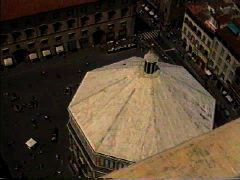
The octagonal building has a diameter of 27.4 meters (90'), and a
height of 31.4 meters (103'). Its dome is patterned from the
Pantheon in Rome.

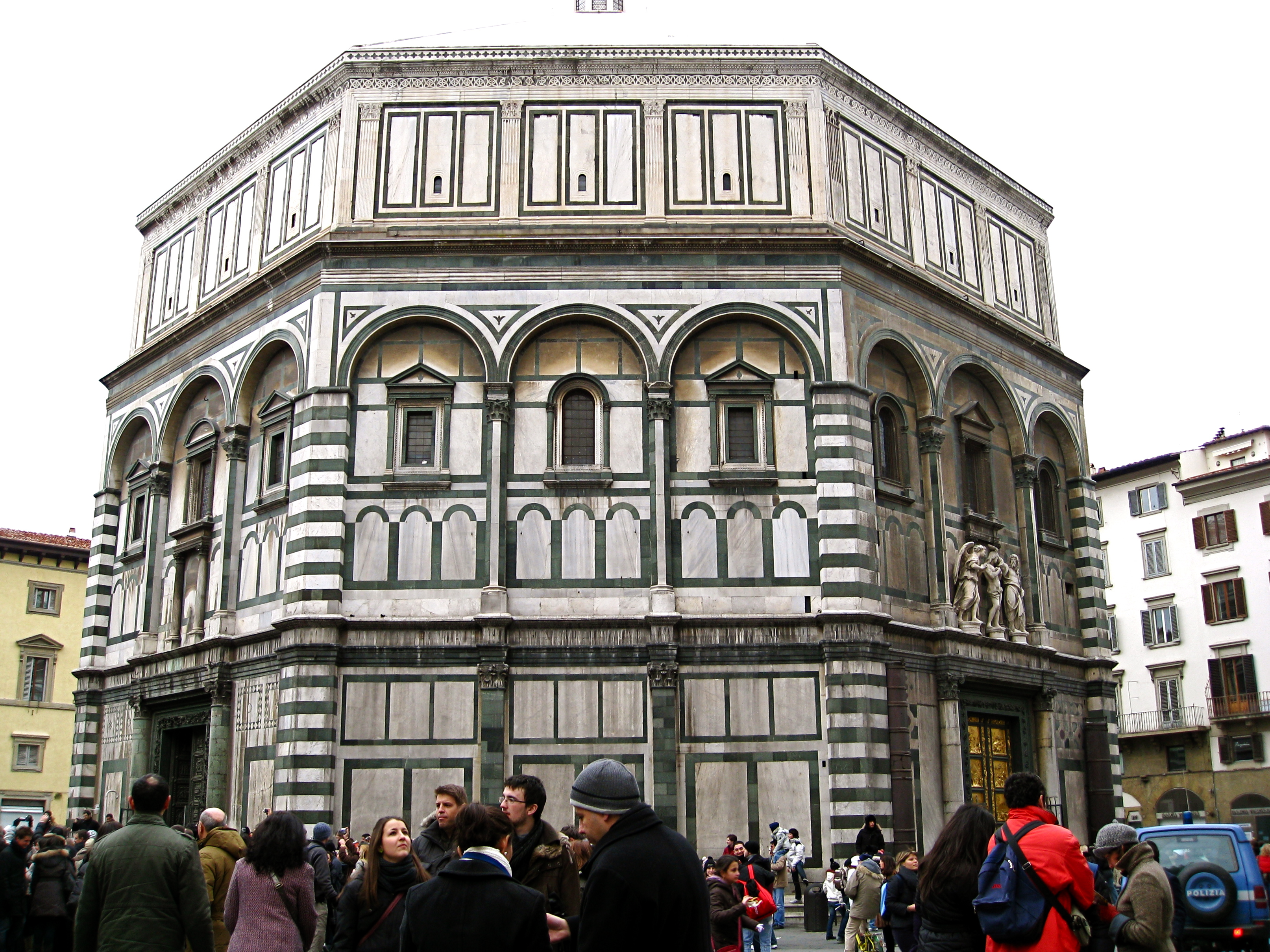
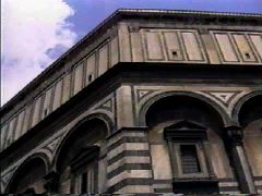
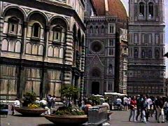
The
exterior facing is of green and white marble applied to two main
horizontal levels. The first is pure post and lintel in appearance,
with flat-faced pilasters topped by an architrave, the strong
horizontal.

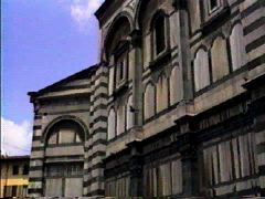
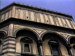
The
second level is composed of polygonally shaped attached columns
supporting semi-circular attached arches. We've seen this
application in Pisa and in Modena, so patterns were developing.
Apparently,
the Italian designers realized that their walls were solid and
massive, and these
applied effects lightened the image visually.

The
lowest level has patterns set in dark marble, simple squares and
rectangles, elements that would reappear as basic designs in the
Renaissance, which would begin here in Florence at the beginning of
the 15th
century. Small windows in the second level have pediments
which alternate from triangle to arch around the Baptistry. Note
carefully that while one side of the octagon might contain a
triangular, arched, triangular pediment, the next octagonal face
follows the rhythm, creating now an arched, triangular, arched
pattern. This is a sign of independent, confident thinking on the
part of the designer. Each
face is different from the adjacent,
and this goes beyond blind obeisance to simple repetition.
Additionally, what removes the appearance from simple classical
forbears is the strong use of contrasting colors, apparently derived
from local influences coming from the Orient and Byzantium. What
could have been a statically classical replication was transformed
into an exciting result.
Colored
accents
give extra verticality to the columns on the 2nd
level, and the arches there are trimmed in dark, giving them a three
dimensional effect. Yet with all of the added exuberance, the forms
are basically classic, and again, all of this had to have been
inspiration for the designers of the Renaissance. The building was
apparently very well preserved by the Florentines.

Local
critics sort of snicker at what they call "zebra stripes"
of the corner pilasters, claiming they sound a dissonant note. These
were apparently added in the 13th
century in some misguided attempt to be trendy, following the striped
stylistic effects produced in Pisa, Luca, and Pistoia. Their effect
is noticeably different from the accentuated classic look of the
Florentines. Apparently,
the stripes replaced a cool gray
Tuscan stone, which earlier added a delicate color to the façade.

There
is a third level, which was applied in the 13th
century, and culminates in a small lantern. That level has very
simple rectangles created by inlaid dark marble, set between
Corinthian pilasters.
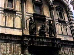
The
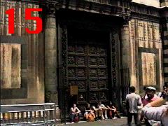
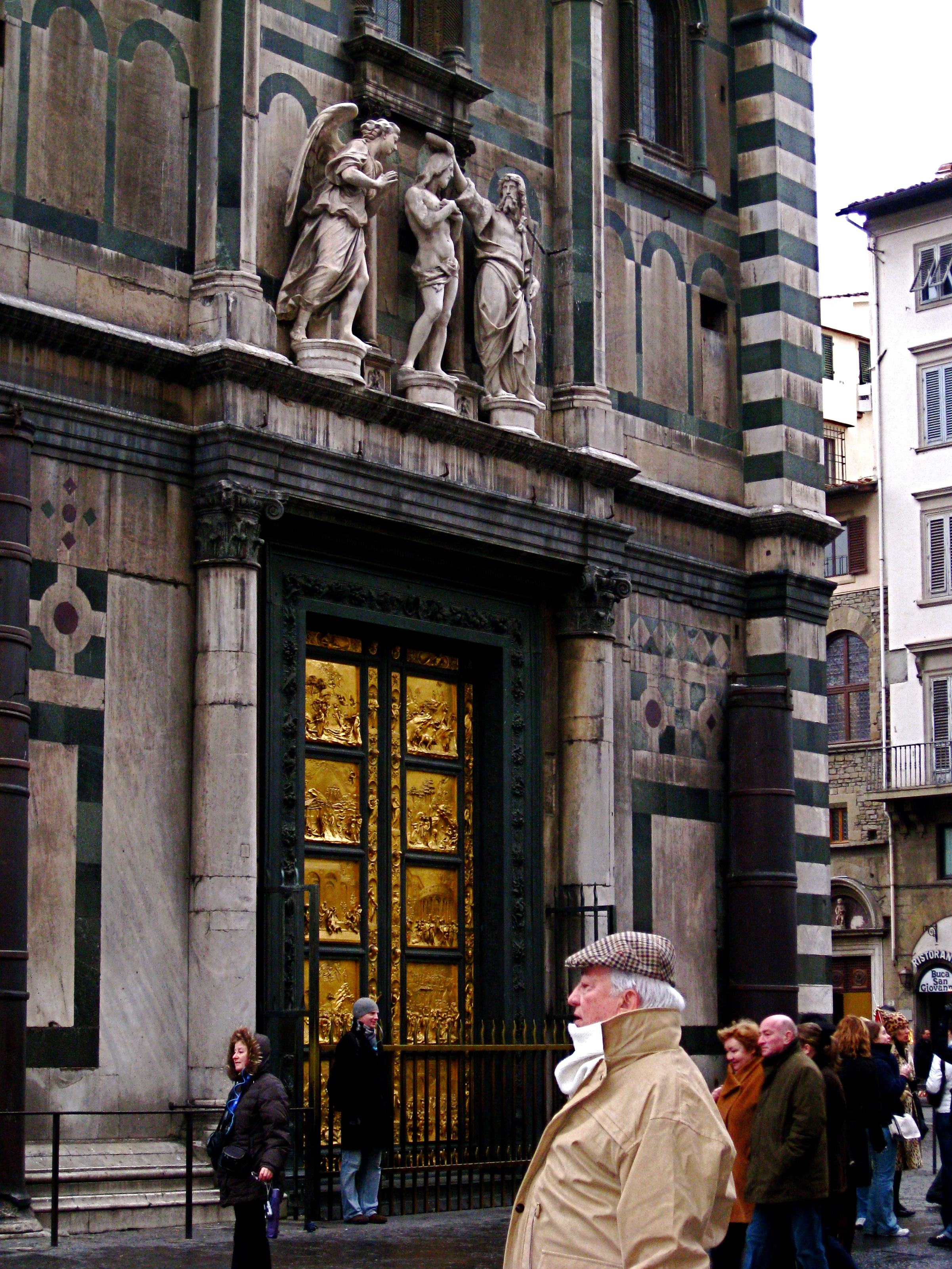
Baptistry is known more for the doors which provide entrance into the
building on the north, east, and south sides.

The
north doors marked the beginning of the Renaissance, in that a
competition was held to determine who would sculpt the bronze panels.
That happened in 1401, and we will discuss that at length in History
II. Not to keep you in suspense - the winning design was by Lorenzo
Ghiberti.

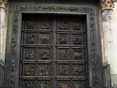
In
our time frame, Andrea Pisano designed doors which were first placed
opposite the Cathedral, on the east side, in 1336. They were later
moved to the south, to be replaced by what Michelangelo called "the
gates of Paradise," also designed by Ghiberti, and placed in
1452.


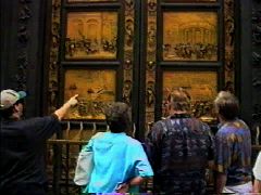
The
“gates of paradise,” the second set of doors designed by
Ghiberti.
The
interior is surrounded by granite columns and pilasters, which create
a matroneum (loggia-type space) and support the dome. The columns,
with their bases and capitals, were taken from a classical building,
origin unknown. Between the columns there is a bit of jumbled marble
workings, which really add confusion to the otherwise stately layout.
The
floor is an inlaid mixture of patterns, done between the 12th
and 13th
centuries. The ceiling is more coordinated
and is a dazzling display of gold mosaics begun in 1226 and finished
in the beginning of the 14th
century. Every inch of the interior
features some form of artistic decoration.

As
a parting note, the Baptistry was the only such site in all of
Florence for the baptism of newborn babies through the 19th
century.
Italian
provinces developed a great diversity of Romanesque architectural
styles. Just so that you do not venture forth into the world without
being armed with the generalities mentioned above - and they do hold
true in a general way, here they are:
Northern:
somberly impressive buildings often had rough-looking exteriors.
Flat, severe entrance facades masked the naves and aisles. Interiors
featured groined vaulting of heavy proportions, showing ribs.
Central:
Italian architects created few structural innovations in this region
and continued to use classical decorative elements. Tuscan and Roman
churches featured classical Corinthian capitals and acanthus borders,
as well as colored marble in geometric patterns; open arcades,
colonnades, and galleries; and facades with sculptures in relief.
Southern:
a rich style combining Byzantine, Roman, Arabic, Lombard, and Norman
elements was created, with lavish use of mosaic decorations and
interlaced pointed-arch arcades possibly brought by the Moors.
An
unarguable feature of the Italian
Romanesque,
was its horizontality.
Campaniles
provided the vertical feeling,
and it was from those towers that worshippers were summoned to
prayer. The
towers doubled as watchtowers, and their height
became a symbol of local pride and power.
Baptistries developed as separate
entities.
©
Architecture Past Present & Future - Edward D. Levinson, 2009
